Exploring Similarity Search with Prompted Subspaces
Introduction
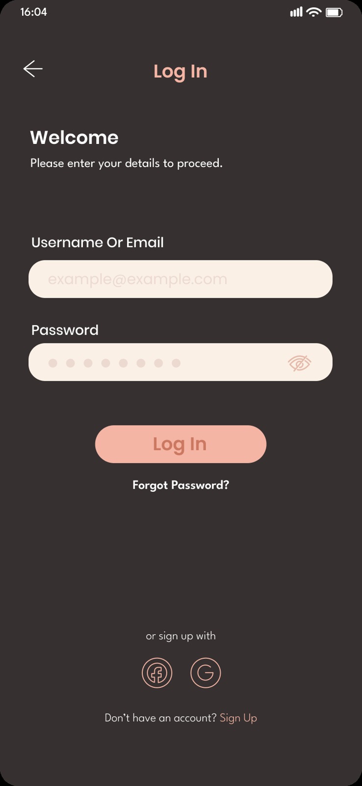
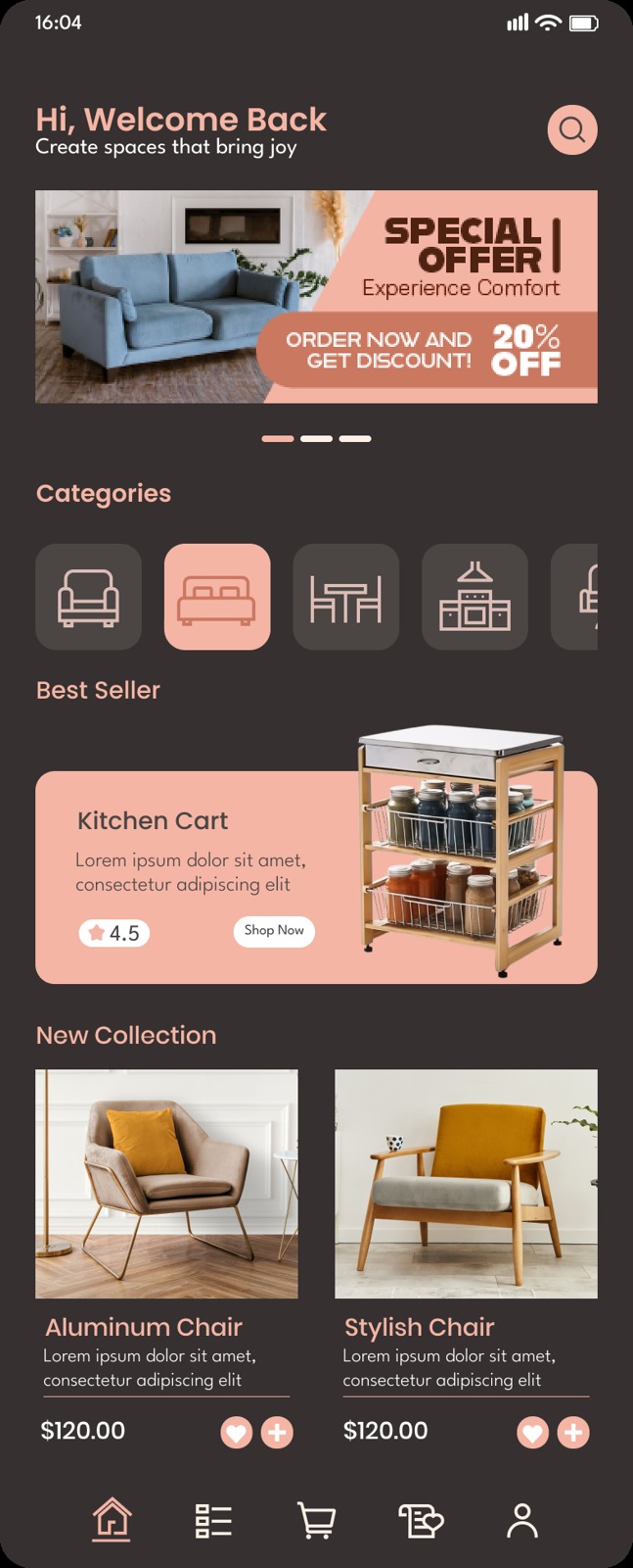
Which of the two screenshots on the right is more similar to the query?
Query

A
B
Your answer probably depends on what you’re comparing. If you’re considering it in terms of what kind of screen it is, then screen A, which is another login screen, is a closer match. But if you’re thinking about how the screen looks, it would probably be screen B — it is from the same app, after all.
In similarity search, context matters. A designer looking for inspiration might want other login pages, and that same designer looking for ways to adhere to a design style might want other pages in the same theme.
Standard approaches to similarity search don’t let us choose this way. Embedding-based retrieval is the typical way to build such a system: embed every image in a collection, embed the query, and then return images with the highest cosine similarity to the query. This guide explains embedding-based similarity search in more detail. Under Gemini Embedding 2 embeddings, the query scores 0.873 against A and 0.786 against B. The model weighs what the screen is over how it looks.
With standard embedding-based retrieval, we’re stuck now. If we wanted to bias towards visual similarity over conceptual similarity, we would have to change models altogether. In theory, though, an embedding produced from a strong model like Gemini Embedding 2 should hold countless directions we could grade similarity along. The problem here is that cosine similarity between embeddings ends up weighing all of them at once. We don’t have an easy way to compare along only the dimensions we care about.
This post explores a way to add control without changing models. We call it Concept Lenses. If we use a multimodal embedding model for search, we can embed a list of text prompts that describe the kind of similarity we care about, like colors or design styles. From those embeddings we can define a subspace such that searching inside it steers results toward that kind of similarity.
We use Gemini Embedding 2 at 768 dimensions for all experiments in this post. We explore similarity search over two image collections: 2,817 UI screenshots from Figma Community, collected in the Figma2Code dataset, and a 5,000-image subsample of LAION Pop.
Zero-shot classification with embeddings
Multimodal embedding models are trained so that an image and text describing it land close to each other in embedding space. CLIP, one of the first widely used multimodal embedding models, learned this by training on 400 million image-caption pairs collected from the internet with a contrastive loss. This pushes each image towards its caption and away from the others. In the end, semantically similar text and images have a high cosine similarity, and dissimilar pairs a low one.
Because text and images share one space, a group of text embeddings can also act as a multi-class classifier without any extra training. First, write one text prompt per class. For example, “a photo of a dog” or “a photo of a cat”. Then, to classify an image, compute its cosine similarity to each prompt embedding. The highest-scoring prompt is the predicted class. We can also get a probability vector by applying softmax with a temperature.
The classes could be basically anything, so long as they are well-represented in the embedding model’s training data.
an image dominated by {class}a ui design with a {class} accent colora ui design of {class}a ui design in a {class} style
- black 0.3076 86%
- white 0.2775 4%
- orange 0.2859 10%
- blue 0.2498 <1%
- green 0.2320 <1%
- black 0.2502 <1%
- white 0.2801 9%
- orange 0.3032 90%
- blue 0.2480 <1%
- green 0.2394 <1%
- black 0.2466 1%
- white 0.2891 83%
- orange 0.2619 5%
- blue 0.2278 <1%
- green 0.2684 10%
There’s one possible route to controlling similarity search here. Each prompt in our zero-shot classifier sort of acts like an axis, where an image’s score against it measures how much of that class the image represents. We could stack the scores together into a vector. Images whose vectors land close to each other should be similar along just the concepts our prompts describe.
This approach, which we call prompt scores, does work to an extent. In practice, though, the space these vectors represent is distorted, in two ways:
- Every prompt embedding shares a common component, so many of the axes overlap. As the explorer above shows, all of the raw prompt vectors are rather close to each other.
- The prompts themselves can overlap in meaning too. For example, “black” and “gray” point in more similar directions than “black” and “red”. When we have two prompts that point in nearly the same direction, our distance calculations end up biased along that direction as well. Similarity search ends up brittle, highly dependent on our prompt set construction.
We will compare prompt scores against other approaches in the Evaluation section.
Embedding subspaces
So what properties do we actually want from a concept space?
- Distance reflects real semantic difference. Distance between two images should track how different they actually are along the concept, not just how many prompts or what prompts we happened to write.
- Axes are orthogonal. Each axis should measure something distinct. No difference is counted twice.
Try as we might, the orthogonal axes requirement isn’t possible to achieve just by writing better prompts. Many concepts have classes that genuinely overlap. Instead, what we need is a way to take a set of prompts as they are and pull out an orthogonal set of axes from the space their embeddings span.
Luckily, that’s exactly what eigenvectors and eigenvalues give us!
Approach
This section is available in both and in
We propose a two-step approach to doing similarity search along a target concept: first, build a concept space from a set of prompts, then project each image into it to do similarity search.
Building the concept space. We start with a set of prompts describing the target concept, for example, a list of colors. Then:
- Center the prompts. Take the mean of all prompt embeddings and subtract it from each.
- Find the principal directions. Compute the eigenvectors and eigenvalues of the centered prompt embeddings. Eigenvectors are inherently orthogonal, so each captures a different property of the concept space.
- Keep the top k vectors. Each eigenvalue tells us how important its corresponding eigenvector is. We keep the top k eigenvectors by eigenvalue. The choice of k is a hyperparameter we can tune. We explore this in the Evaluation section.
This process is largely the same as running principal component analysis (PCA) over the prompt embeddings. The resulting k vectors are the axes of our concept space.
Projecting images. To move an image embedding to the concept space, we just project it: take the dot product of the image embedding with each of the k axes. These k numbers are the image’s coordinates in the concept space. We then rescale the coordinates to unit length, so only their direction counts. Just like with the normal embeddings, we use cosine similarity to get nearest neighbors between projected embeddings.
Building the concept space. First, collect a set of prompts describing the concept we want to compare along. Let be the embeddings of those prompts.
-
Center the embeddings. Compute the mean of all embeddings and subtract it from each:
-
Find the principal components. Calculate the covariance matrix of the centered embeddings and compute its eigenvalues and eigenvectors:
Because is symmetric, its eigenvectors are already orthonormal. Each eigenvalue is the variance of the prompts along . The first eigenvector explains, comparatively, the most variance among the prompts and so on.
-
Keep the top . Stack the first eigenvectors as rows of a basis
Projecting images. Given an image embedding , simply multiply by to transform it to our concept subspace and then renormalize:
In this concept space, we use cosine similarity as our distance metric. Because the rows of are orthonormal, the score depends only on the parts of that lie in the concept subspace.
Examples
First, a demonstration of what this looks like with just two prompts. We take 18 images from the LAION Pop dataset, ranging from photos to drawings, with 3D renders in between, and embed them along with prompts for “a photograph” and “a drawing”. With two prompts, the concept lens has only a single axis: the direction from one prompt to the other. The viewer below shows the images and prompts both in a UMAP plot UMAP is a method that flattens high-dimensional embeddings into 2D while keeping each point’s nearest neighbors close. and under a concept lens projection.
Under the lens, the images line up from drawn to photographed. Illustrations sit cleanly on the left, photographs on the right, and 3D renders in between, closer to the drawings. The axis essentially sorts the images by how photographic they look.
Things get a little more abstract when we expand from two to three prompts. Let’s see what the lens looks like with “a 3D render” added.
In the full embedding space, “a 3D render” and “a drawing” sit close to each other, and both are far away from “a photograph”. This is the overlap problem we described earlier. With prompt scores, a drawing and a render would score similarly high on both of these prompts, so they’re hard to tell apart, while their shared difference gets counted twice.
On the other hand, under the concept lens, photographs, renders, and illustrations fall cleanly into three distinct clusters. This is great, and fulfills the properties we want. Distance in this space actually reflects distance according to the concepts our prompts describe.
We can now revisit our example from the introduction section. The table below compares the query’s distance to both another app’s login page and another screen from the same app under three lenses.
| Query | A | B |
|---|---|---|
| no lens | 0.873 | 0.786 |
| colors lens | 0.632 | 0.840 |
| accent color lens | 0.474 | 0.882 |
| screen types lens | 0.866 | 0.337 |
Each number is the cosine similarity between each screenshot and the query, measured in each lens’s space. The more similar image in each row is bolded.
With no lens, A is closer by ~0.09. Under the colors and accent color lenses, though, B is closer. But under the screen type lens, A is closer again by a wide margin. Each lens gives the answer a person would give if we were to ask, “which screen is more similar to the query in terms of X?”
To try your own queries and lenses, check out the Concept Lenses demo, which runs over the full LAION Pop and UI Design datasets.
Evaluation
Now that we’ve established concept lenses behave well on a small scale, we can expand our experiments to measure how well they perform on whole datasets and also compare with simpler approaches.
Experiment setup
We evaluate four lenses on each dataset.
- On LAION Pop: color, medium (e.g. photograph, oil painting), art style, and photograph subject (e.g. person, object).
- On UI Designs: color, accent color, screen type (e.g. login page, landing page), and app category (e.g. finance, social media).
All prompts are written by Opus 5.5, with web search access to reference taxonomies. The viewer below shows the prompts for each lens’s prompt set.
"an image dominated by {x}"
- red
- orange
- yellow
- green
- blue
- purple
- pink
- brown
- black
- white
- gray
- turquoise
- navy blue
- cream
- gold
- silver
- pastel colors
- vivid colors
- teal blue
- burgundy red
- lavender purple
- ochre yellow
- coral pink
- olive green
- beige
- magenta
- cyan
- lime green
- charcoal gray
- ivory
- peach
- maroon
- indigo
- mint green
"a ui design with {x} accents"
- red
- orange
- yellow
- lime green
- green
- teal
- cyan
- blue
- navy blue
- indigo
- purple
- magenta
- pink
- coral
- gold
"a ui design of {x} page"
- an account setup
- a guided tour and tutorial
- a signup
- a verification
- a delete and deactivate account
- a forgot password
- a login
- a my account and profile
- a settings and preferences
- an acknowledgement and success
- an action option
- a confirmation
- an empty state
- an error
- a feature info
- a feedback
- a help and support
- a loading
- a permission
- a suggestions and similar items
- a cart and bag
- a checkout
- an order confirmation
- an order detail
- an order history
- a product detail
- a promotions and rewards
- a shop and storefront
- a billing
- a payment method
- a pricing
- a subscription and paywall
- a wallet and balance
- an achievements and awards
- a chat detail
- a comments
- a followers and following
- an invite teammates
- a leaderboard
- a notifications
- a reviews and ratings
- a social feed
- a user or group profile
- an emails and messages
- a call
- a chat bot
- an article detail
- a browse and discover
- a class and lesson detail
- an event detail
- a home
- a news feed
- a note detail
- a post detail
- a quiz
- a recipe detail
- a song and podcast detail
- a stories
- a TV show and movie detail
- a bookmarks and collections
- a playlists
- a charts
- a dashboard
- a progress
- a goal and task
- a calendar
- a date and time
- a timer and clock
- a timeline and history
- a kanban board
- an audio player
- an audio and video recorder
- a video player
- a media editor
- a canvas
- a code editor
- a command palette
- a map
- a QR Code
- a trash and archive
- a landing
- a portfolio
- a resume
- a multi-column layout
"a screenshot of a {x} app"
- AI
- business
- collaboration
- communication
- CRM
- crypto and Web3
- developer tools
- education
- entertainment
- finance
- food and drink
- graphics and design
- health and fitness
- jobs and recruitment
- lifestyle
- medical
- music and audio
- maps and navigation
- news
- photo and video
- productivity
- real estate
- reference
- shopping
- social networking
- sports
- travel and transportation
- utilities
"a ui design of {x}"
- a resume
- a personal portfolio
- a company landing page
- a SaaS product website
- a blog
- an online store website
- a presentation slide
- an email newsletter
- a photo
- a black and white photo
- a polaroid photo
- an oil painting
- a watercolor painting
- an acrylic painting
- a gouache
- an airbrush painting
- a digital painting
- a matte painting
- digital art
- pixel art
- vector art
- a 3D render
- a low poly render
- a pencil sketch
- a charcoal drawing
- an ink drawing
- a color pencil sketch
- a pastel
- a woodcut
- an etching
- an engraving
- a screenprint
- an illustration
- a cartoon
- a bronze sculpture
- a marble sculpture
- a wood carving
- an embroidery
- a cross stitch
- a mosaic
- a stained glass window
- a collage
- a tattoo
- graffiti art
"a painting in the style of {x}"
- Renaissance
- Baroque
- Rococo
- Romanticism
- Realism
- Impressionism
- Post-Impressionism
- Expressionism
- Cubism
- Surrealism
- Abstract Expressionism
- Pop Art
- Art Nouveau
- Ukiyo-e
- Bauhaus
- Photorealism
- Street Art
"an illustration, {x} style"
- flat vector
- children's book
- comic book
- anime
- retro travel poster
- Art Deco
- kawaii
- black and white line art
- vintage botanical
- tattoo flash
- isometric
"digital art, {x} style"
- concept art
- fantasy
- sci-fi
- cyberpunk
- synthwave
- pixel art
- low poly
- glossy 3D render
- glitch art
- psychedelic
- steampunk
"an image of {x}"
- a woman
- a man
- a child
- a group of people
- clothing worn by a model
- shoes
- jewelry
- a handbag
- a dog
- a cat
- a wild animal
- a bird
- a plated meal
- a dessert
- a drink
- fresh fruit and vegetables
- a car
- a motorcycle
- an airplane
- a boat
- a building exterior
- a city skyline
- a bridge
- a historic monument
- a living room
- a kitchen
- a bedroom
- a shop interior
- a mountain landscape
- a beach
- a forest
- flowers
- a gadget
- a piece of furniture
- a toy
- a household product
- a fantasy creature
- a warrior character
- a spaceship
- a robot
- a logo
- text and typography
- a decorative pattern
- a map
The prompts that define the subspace for each target concept.
To construct eval datasets, we pick 50 relevant query images by hand for each lens. For example, for accent color evals, we make sure each query design has an obvious accent color. We measure retrieval with Precision@10, which is the fraction of a query’s top 10 nearest neighbors that are similar to it on the target concept.
We grade results with Opus 5.5. For each query-result pair, we simply ask the model whether the result matches the query on the target concept. This is followed by a lightweight human pass over the labels. We prefer this to more explicit, class-based labeling approaches because similarity is inherently fuzzy.
Comparison with baselines
In the following table, we compare four different approaches to similarity search. Base retrieves the top 10 neighbors with just the full Gemini Embedding 2 vectors, using cosine similarity as the distance metric. Prompt scores represents each image by a vector of its cosine similarities to the lens’s prompts and finds nearest neighbors with L2 distance.
Under concept lens, we try two different distance metrics. Cosine is the method described in the Approach section. L2 is a variant which skips post-projection renormalization and compares neighbors with Euclidean distance instead of cosine.
| concept lens | ||||||
|---|---|---|---|---|---|---|
| dataset | concept | k | Base | Prompt scores | L2 | Cosine |
| LAION Pop | Color profile | 32 | 0.30 | 0.42 | 0.48 | 0.52 |
| Medium | 32 | 0.61 | 0.71 | 0.76 | 0.79 | |
| Art style | 32 | 0.45 | 0.38 | 0.51 | 0.55 | |
| Subject | 32 | 0.70 | 0.72 | 0.78 | 0.79 | |
| UI designs | Color profile | 32 | 0.24 | 0.48 | 0.54 | 0.59 |
| Accent color | 14 | 0.24 | 0.63 | 0.63 | 0.72 | |
| Screen type | 64 | 0.60 | 0.63 | 0.71 | 0.76 | |
| App category | 32 | 0.64 | 0.63 | 0.75 | 0.79 | |
Both lens variants beat the base embedding on every concept, and concept lens with cosine distance achieves a clean sweep against all other similarity search approaches. The gains are largest on visual concepts. Accent color shoots from 0.24 to 0.72, whereas a semantic concept like app category style goes up modestly from 0.64 to 0.79. This is a sign that Gemini Embedding 2 by default clusters more by conceptual similarity than by visual similarity.
Prompt scores results are more of a mixed bag. Compared to the base embedding, they much better on half of the concepts, and either only slightly better or worse on the other half. Squinting at the results a bit, it seems like the more abstract a concept, the less improvement prompt scores add. This is likely because abstract concepts are harder to write orthogonal-ish prompts for. Either way, prompt scores performs worse than concept lenses on every concept.
In the spirit of open science, the explorer below shows eval results for all lenses and approaches. Green outlines mark results Opus 5.5 judged to be similar; red outlines mark results it didn’t.
Eval explorer
Lens, cosine · P@10 0.52
judge's question
Is the candidate's color profile similar to the query's? Look at the palette as a whole: the dominant colors, how light or dark the image is, and how saturated or muted it is. Answer yes if an art director would say the two images use a similar color palette. Ignore the subject, the medium, the style and the composition.
Effect of subspace size on performance
The experiments above pick a high value of k for all concepts. To see how subspace dimensionality matters, we rerun the evaluation across different values of k. Alongside each score, we also show the prompt variance kept at each k, calculated by taking the sum of eigenvalues 1 to k and dividing by the sum of all eigenvalues. This is essentially the share of the prompt embeddings’ total variance captured by the top k principal components.
LAION Pop
Color profile
Medium
Art style
Subject
UI designs
Color profile
Accent color
Screen type
App category
As we would expect, keeping too few dimensions hurts performance. At k=4, six of the eight lenses score worse than just using the base embedding directly. This can be explained by looking at the prompt variance. At k=4, the subspace explains less than half of the prompts’ total variance for most lenses.
Most lenses stop improving at around 80% variance kept. Past that, most lenses level off quickly — color, medium, art style, and accent color are within 0.04 of their max score. This means that when choosing k for a new lens, we can use prompt variance to make an educated guess of the best value.
An interesting pattern here is that the lenses that need more dimensions to do well seem to be the ones that can have a large variety of fine-grained values. For example, screen types and photo subjects. When choosing k for a new lens, we should use prompt variance captured as a proxy.
Limitations and future work
Across two datasets and eight total concepts, we find that similarity search with a concept lens beat the base embedding and prompt scores on every concept. However, there are some limits to how much we can take away from the current results. For one, we can’t tell how much the optimal subspace dimensionality actually depends on the concept versus the prompt count.
Some open questions for future work:
- Estimating concept support. Not all concept categories are prompt-able. Are there ways we can judge, a priori, if a model will perform well under a given concept lens?
- Embedding model training. What interplays are there between fine-tuning an embedding model and its downstream performance on similarity search? Do we even need concept lenses if we fine-tune?
- Better prompt sets. Our prompt sets here were written by asking Opus 5.5 to cover each concept as fully as possible. Are there better ways we can approach prompt set construction? Does more coverage at the cost of lower quality prompts actually help?
- Classifier-free gating. Some images won’t fit naturally into a given subspace. Can we invent a good classifier-free approach to discard unrelated images?
- Other domains. Will this approach extend naturally to domains like audio and video search, or even text-to-text search?
Ending note
Concept lenses give us a way to “prompt” embeddings into a subspace where distance means distance along that concept. With them, we can run similarity search along a chosen concept, rather than be beholden to whatever structure the embedding model happened to learn. This kind of retrieval is especially useful in creative work, where a user looking for inspiration might want to find images that are similar in one specific way.
Of course, in today’s day and age, one might ask what the point of all this is. With LLMs, we can just burn more compute to achieve much the same result. Agentic retrieval with Opus, or even map-filter with a cheap, general classifier like Jev, would likely do even better than a well-formed concept lens, since LLMs are good at high-precision search.
Still, I think there’s value in working on and thinking about the primitives (albeit much less market opportunity). Agents search with tools, and any improvement in those tools improves agentic retrieval by default. And by engaging with the space directly as we did in this post, we end up learning far more than we would by just throwing this into the transformer hole too.
You can play around with Concept Lenses yourself here.